Wednesday, 8 January 2014

MAGAZINE FRONT COVER OVERVIEWS


The six film magazines have been designed to successfully promote films within the horror genre. However they all belong to different sub genres, but in essence are still effective. Through carrying out this investigation of them and by comparing them to each other, it is possible to identify shared features within them and to establish repeated patterns.

All six magazine front covers feature typical magazine conventions. We expect to see general conventions in all such as the main image dominating the page and the masthead to be right at the top of the page. The masthead is always the largest piece of text, then the main image dominating the page revealing to the audience that the film's narrative will have something important to do with that selected image on the cover.

As well as this, we see other conventions. Almost all of the film magazine covers include the main character, or villain who is generally going to be the lead within the movie. For example, On the total film front cover, the film 'Jennifer's Body' is being advertised, and she is in fact the only magazine front cover that features the antagonist who is tormented by an evil force. This is proven through the use of mise en scene as her hands have blood dripping from them, intriguing the audience into wondering what has just happened. The pure iconography of blood is used to the film's advantage due to it taking the sub genre of slasher. Another convention that is effectively carried out with all 5 of the six magazine covers is that the protagonist is used as the main image instead of the antagonist, interestingly the opposite of a film poster. Mainly because the audience of magazines, are more interested with the protagonist's background within the movie. The character of Megan Fox, connotes the idea of a 'bimbo' who would fit the victim role perfectly due to being provocatively dressed and even carrying out a smouldering look through the direct address. 

In addition to this, four of the magazine front covers, use direct address to lure the audience in. The use of this mode of address means that the audience create a connection between themselves and the horror character, adding to the element of fear, as they will then want to see how the victims appeal to their fate within the film as this direct address shows confidence on the villains behalf.  Much unlike the posters, children are not featured on the magazine front covers, this is done on purpose this is because the audience of the magazine are much more interested with the thought of indulging into the narrative rather than be instantly frightened.

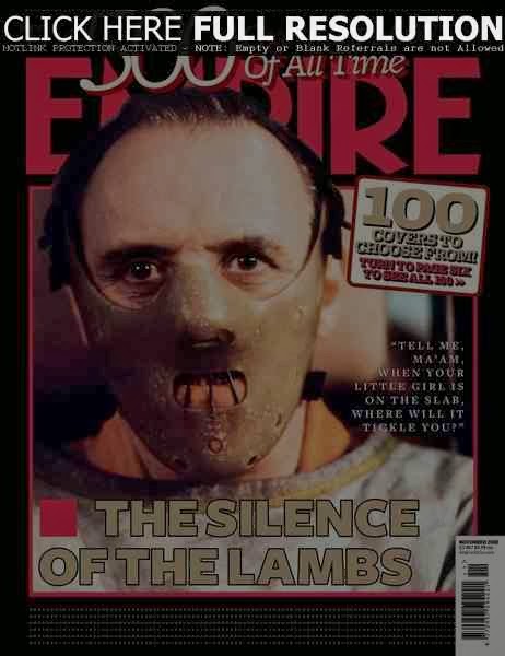
The images presented in the six magazine front cover are designed ultimately to for the audience to be persuaded and question the front cover, which will later make them purchase the magazine and therefore read about the films synopsis. For example, the empire magazine cover which features 'the silence of the lambs', who has the famous actor of Anthony Hopkins, instantly gripping the audience as he is a successful actor. The name however has no correlation to the image, hooking the reader into why the actor is wearing some sort of mask which is in fact iconic for horrors, and what this has to do with the chosen film name.

Four of the six covers do not include any sell lines, indicating that the featured film will be the main topic of the magazine, appealing the niche horror magazine audience. This seems to be a clear conventions for the magazines that are specified to only horror such as Fangoria, where as when Empire have used a horror film on the front cover is seen as a special edition and not a regular occurrence.

There is a consistent pattern with colours too, dark warm colours such as black, red and dark blues are common to help create the mysterious and evil mood.  However in the case for Empire's Jennifer's body issue the colours are much more cold, with a pale white nature to show that Megan fox stands out, perhaps indicating the reason for her being the victim, she stood out amongst all the others. Whereas the other five covers, are surrounded by the warm colours, portraying by the idea that their existence is taken over by evil, and this now revolves around their lives.

In each magazine cover the masthead is placed at the top of the page, so the readers are aware of exactly what magazine it is. It's also the largest text, allowing them to understand the magazine before being induced by the image and further persuaded. Fangoria features an specifically designed title which plays on the title itself, as there are fangs coming out of each end of the title, one again reassuring the audience of the horror genre. Whereas 'Monsters underground' includes skull imagery which is a commonly used prop within horrors.  The use of having the title at the top of the page gives the audience the knowledge of knowing whether or not the magazine is an established and well known one, for example Empire is a well known successful film magazine which does not specify in horror. So for such a well branded magazine to include a horror would create the impression that the featured film is of a high status within the genre. Whereas the magazine Fangoria specialises in horror films, so the feature of this particular genre is not unusual or in fact an indication of it holding a high status. Most of the above film covers include the name of the film to entice readers whereas others choose to use the actor for marketing. For example Megan fox is used to publicize the film 'Jenifer's Body' whereas the Insidious front cover includes no mention of the actors that will feature in the film, meaning that the directors and creators of this film have chosen to let the narrative market the film.

There are symbiotic links that occur between film posters, magazine front covers and trailers which identify which movie this promotional piece belongs to. For example the Insidious magazine front cover continues the repeated colour scheme that occurs within all three of these promotional pieces. Such as the dark red, black and glimpses of white tones that feature throughout all three, the choice of using these particular colours not only abides by conventions but gives the audience an insight into the nature of the film insidious. Another symbiotic link that features is under lighting, the magazine front cover displays the protagonist, but because of the under lighting a devious persona is revealed which is reinforced by the dark colours. The film poster also uses dark lighting to portray possession of the young child who features. Therefore proving that by using symbiotic links for a promotional package it allows the audience to understand the narrative better whilst giving them an insight into the world of the movie.

All the magazine covers in this selection are effective in different ways, simplicity is a common feature with the main image, and bold texts doing most of the persuasion. I became inspired through the simplicity yet effectiveness of the above magazine front covers. Perhaps by me carrying out certain conventions such as the uses of dismal colours and devious lighting i will be able to create the same effect with our target audience. Although it seems to be a convention that the protagonist appears on the front cover, i feel that by using our antagonist it may cause controversy which could work in our favour as it could get our target audience to converse about the magazine, forming more publicity.

Monday, 6 January 2014

MAGAZINE FRONT COVER ANALYSES


·         The main image dominated the whole page; however has no relation to the sell lines. This allows the readership to assume that the narrative of the story is enough to draw them in to watching the film. As the antagonist dominates the whole page it suggests that most of the narrative is based upon the antagonist having some kind of unique link with it. The image displays this demonic protagonist as evil one, as the only thing that is bringing light towards her is the candle, proving that there is no light within her. The demonic female’s mouth is slightly smiling, showing a devious and in fact gory as the readers are not quite sure whether or not there is blood departing from her mouth. This specific image creates the idea that the narrative of this film is one that belongs to the supernatural genre due to the inhuman species appearing on the front cover. The stock location is in fact pitch black, indicating that this antagonist or demon is not from the 'real world' and actually intruding. The film poster for Insidious includes a young boy, with the same medium shot as well as direct address, allowing readers/audience to share a symbiotic link, however because the shots are so similar it is left to the audience/readers that it could be that this demonic being is what is troubling the antagonist.        


The masthead of this magazine is the largest text of the page, making it catch the reader’s eye instantly. The typography itself fits well with the genre, the text can be broken down as the readers being 'fans' of 'gore which is extremely suitable due to it being a niche directed solely for a horror audience. In addition to this the ends of the word has fangs hanging down which also correlates with the title. The use of the colour white for the masthead connotes purity and innocence which is then outlined with red which implies danger and fury, imitating most bases of horror films in general. The masthead is distinctive and suitable for the readers as once read by the audience it's clear just what genre this magazine appeals to and is designed for, making it effective. This also indicates that the readership are in fact interested in gore, and the physically thrilling horrors, hence why Insidious a jumpy possession film is featured. The brand identity is reinforced through the same colours being used within each issue of the magazine, as well as the sell lines being placed within the same places, while the names of the featured films are placed towards the bottom of the front cover. This implies that the image itself should be enough to draw in the readers.

The sell lines included are solely to do with upcoming or well anticipated horrors. Clearly the interest of the readership is horror films as they are becoming members and ordering this magazine online. The tactics used to grip the readers are by marketing the actors within, and a little description of the film or perhaps a quote. For example, in red one of the sell lines read 'Hobo with a shot gun'. The colour red once again signifies danger and blood which correlates well with the sell line due to the mention of a gun. The relationship between the magazine and its readers seems to be an informal one, due to mention of a 'hobo'. The sell line also seems quite peculiar intriguing the audience in a way that doesn't have to directly appeal with hints of horror portraying the significance of the mode of address between the audience and the magazine.

The main colours on this magazine front cover are white and red, implying that evil and danger will always overrule innocence and purity which are also connotations of horror films. These colours are also used for the film insidious itself, which stands for the same meaning of purity being dominated by evil. It can also relate to the red being the possessive force, and the white being the protagonist who falls victim directly relating to the film itself. These colours are conventional for horror films, so are not unusual in anyway but in fact carrying out an unspoken tradition.

The text to image ratio is 1:3, as images dominate the page, indicating that for this magazine images are more significant to the text. There is also a line of four pictures formed in a slideshow format at the bottom of the page displaying to the readership what may be featured within. There is a puff to entice the readership further by allowing them to know they will receive a free poster. The layout is effective as the attention is directed to the main image, and then led onto the sell lines which does not give away too much information forcing the audience to open the magazine in order to find out anything more. The conventions of a usual magazine are carried out but however in a unique way, as there is a strap line which reiterating to the readers that the horrors featured are global. It includes sell lines and puff's but in a way that is conventional to the magazine, but unconventional to non horror magazines as the sell lines are of a much smaller font making them visible but not from a far, they also only take up the middle section of both left and right sides of the page, making the main focus is the main image.


Fangoria is a niche magazine specifically for horror fans, meaning that the advertisements of the films that feature have to be extremely persuasive in order for the audience to be lured into watching the film.

The main image for this magazine issue dominates the page and attracts the reader's attention instantly due to the iconic prop of a mask being used. The main image is seen as the protagonist due to antagonist wearing a pale blue mask, pale blue connotes nature which correlates with the title as it is set in the woods. This is slightly strange as red is the main theme or horror yet the blue has been used, indicating that the film may be of a strange nature and not be as we as an audience presumed.  Due to it dominating the whole page, this portrays the idea that the narrative is again the main feature of this film, that there is no need for any sell line or persuasive text as the narrative itself speaks for itself. The image displays an irregular antagonist who is wearing an unusual mask, which takes the form of a childlike face, perhaps showing that the protagonists of this horror may be of a younger age. The antagonist is wearing a suit, which the readers would normally associate with for formal events or even a job, signifying to the audience that the antagonist's main job or ambition is life is to be the antagonist. There is no stock location shown on this front cover, meaning that the readership are not supposed to know too much about the film, as they would expect the location to the in the woods. Keeping it up to their imagination. The film poster for The Cabin in the Woods does not share a correlation with the magazine front cover, as the poster portrays a cabin that has been in fact victimized and fallen protagonist to an antagonist within the woods. The colours are or a cold pale nature, to sense normality which will later be ruined within this slasher. The only links between the two are the use of pale colours, showing no such symbiotic link. This may be due to the magazine front cover too frightening for everyday marketing, that can be placed anywhere in public whereas the readership of this magazine have signed up for the sole purpose of horror and are available for any graphic or scary imagery. No part of the storyline is revealed, persuading the readership to go ahead and watch the film to find out if their thoughts match to the narrative. A medium shot is used to gain a greater physical view of the antagonist, direct address is also carried out in a way that the antagonist is staring straight at the readership, but we as the readers are unable to look into the characters eyes due to the mask. The mask itself is the only way the readership are able to understand which genre this horror belongs to, as masks are mainly commonly used by an antagonist within slashers.

The masthead is the largest text of the page signifying this is what should catch the reader's attention immediately. This is also the main amount of text on the page other than a sell line placed above the masthead which gives the readers a slight snippet into the world of the movie. Pale blue is colour that is used as the masthead, which is the same pale blue as the villains mask. The name also fits in well with the genre, as the fan enjoy gore, thrilling, and violence which will directly appeal to this readership as the film featured belongs to the slasher sub genre. The brand identity of the magazine is not reinforced within this issue, as there are no sell lines, but however the smaller images that are shown as small snapshots in a slideshow form is placed along the left hand side of the page instead of the bottom but still there. The red and white is still used in some way on the front of the issue showing what film genre it belongs to whilst outlining its brand identity. The masthead colour has been adjusted purely because of the film it features, proving that it is a promotional tool and will help the audience be persuaded into watching the film.

The sell lines included are minimal and only correlate to the movie being advertised; clearly the main interest of this issue is revolved around The Cabin In The Woods. The main persuasive form used for this issue, is to make the front cover revolve around the anticipated film. the sell lines such as 'The first fright since 1979' display the audience to be loyal horror fans as they would know the sort of horror films that occurred within this era. The colours used within this sell line is red and white once again connoting the innocence being overwhelmed by danger and violence which is a feature that appears on each of fangoria's front cover reinforcing the brand identity. There is also a caption by the title of the film that reads 'evil by design' which is solely in red, showing no form of innocence but pure evil, further intriguing the audience into watching the movie.

The main colours on this magazine front cover are black and pale blue, implying that the natural cold colour of blue is overshadowed by black. Indicating that normality (pale blue) will be ruined by some sort of darkness which is believed to be the antagonist on the front cover due to it being surrounded with darkness. These colours and themes are ironic and conventional for horror films, so are not unusual in any way, so the magazine is carrying out tradition.

The text to image ratio is again 1:3, purely because the image dominates the whole page. This indicates that the narrative should and will speak for itself. The layout is effective as the main attention is directed towards the main image, forcing the audience to analyse the cover subconsciously, and because of the lack of sell lines the readership will have no choice but to read further into the magazine and allow themselves to be persuaded into going to see the movie. The normal conventions of a magazine are carried out but again in a unique way, as there are some sell and strap lines, but are not displayed in the way for lifestyle magazines.


Friday, 3 January 2014

TRAILER ANALYSIS THE POSSESSION

THE POSSESSION

The Possession is another modern supernatural horror that also includes elements of possession. This has become increasingly popular with the modern day audience, as these horrific plots appeal to the audience’s fears. The genre of supernatural is implied to the audience when the Em is staring deeply into the box at the yard sale.


This immediately signals to the audience that there is something peculiar within the box. The cuts used within this scene also generate this train of thought for the audience as they all fade into each shot, further reinforcing the idea that there is something mysterious/unusual within the box. This is typical for a supernatural horror as the main narrative for this genre is based around a specific prop that has some connection with the possession itself.


 The producer of The Possession is mentioned at the end of the trailer, in order for them to make a judgement on the trailer itself and then if the need for further persuasion is necessary then the original and artistic views of him (Sam Raimi) will be used to lure the audience in. This also allows the movie to appeal to its correct target audience, as it’s not just targeted at the audience who enjoyed his previous movies (Spider man). The narrative structure of the trailer towards the beginning of the trailer all happens in chronological order, but once the audience get 40 seconds in then the narrative begins to change and it does not go in order. This is conventional to the supernatural genre, as there would be no point in giving too much away. The audience understand that this is not in order by the narrative that is being said over the moving images. Also once the tempo starts to get up beat there is awareness that something supernatural will occur, this is highlighted every so often within the trailer:


 for example when Em the protagonist is swarmed by moths in her bedroom, or when she is overtaken by the possessive spirit inside of her and then stabs her father’s hand with a fork. A lot of the plot is used within the trailer, in order to the lure in the audience. However vital scene such as when Em is being exorcised is not included. This is in order to keep the audience guessing and not giving them the plot of the new equilibrium.


The first shot is of the stock location, a suburban household another convention of horror movies. The colours chosen are mainly of a dark and dreary nature such as dark blues, greys and browns this is to portray that what is happening to Em is dark and twisted. There are many bright colours placed in the trailer however, when Em is being taken into hospital to scan her in order to find out what exactly is inside of her the lighting here is incident lighting which signifies the realism and shock of what is happening.


The colours within this scene are white, and light blues these connote purity, innocence and calm all attributes that Em had before she had become possessed leaving the audience to hope the best for her. The body language within the trailer from Em is what describes to the audience that this movie falls into the possession category of supernatural. Within the last third of the trailer, there is a medium shot of Em who has lost all self control, and is clearly being overtaken by the evil force within her.


This is so evident that the force is being pushed out of her skin which is resembled through the imprints in her skin. This is where the audience acknowledge that this narrative includes possession. Em’s hair and makeup within this scene is minimal, which only reinforces the fact that she is only a child, pulling on the audience’s emotions to make them feel sorry for her. The edits that are displayed to the audience enable them to understand what is going on throughout the trailer. The cut edit signifies that this is the end of the scene; meaning that whatever shot comes next will have some correlation to what just happened but be its own scene.


For example towards the end of the trailer there is a long shot of Em on an empty road with the box on the floor near her she looks possessed at this point which the audience can tell through her facial expression which is blank and staring down to the ground, her body language is overtaken by some sort of force.


This shot ends with a cut that is then closely followed by a shot of Em’s father and a Rabbi who are discussing her situation. The speed of the editing is extremely conventional as it starts up slow and then fastens towards the ending montage, signalling to the audience that something drastic is going to occur. Although there is no direct link between the shots the audience are aware of who they are talking about even though this is a completely different scene. A deep focus is used with the extreme long shot which only includes Em and the possessed box, in order to attract the audience’s attention directly towards the box itself. A soft piano is played in the background at the beginning of the trailer, which sets the tone for the audience. Once Em sets her eyes on the box at the yard sale the noises then change and begin to get harsher and deeper to signify that there is something unusual. There is also no dialogue at this moment only the word ‘cool’ once again just relaying how young and impressionable Em is, allowing the audience to understand just how important this scene it, whilst realising that there is something not quite right with the box, all the more whilst adding a hint of fear. Synchronous sound is used when Em finally opens the box, this is to highlight the momentous moment of the opening of the box, adding to the anticipation the audience have continuously felt. The Dialogue also over shadows the images on screen, allowing the dialogue to correlate with the images. Making sure the audience know exactly what’s going on.  


The straps used are at the end of the trailer and form the sentence ‘This August...Darkness...Lives...Within’, adding to the fear of the unknown and slowly reeling in the audience’s attention towards the final sting. The representation of Em a young girl is vulnerable, innocent and juvenile. All which make the audience feel sorry for her as it isn't her fault that this evil force has chosen to overtake her. This could represent a number of the audience, further intensifying the fear within the trailer. Em’s father is represented as a concerned parent, who is in the middle of a divorce once again this could be reflective of a large number of the audience reinforcing the fear factor as they do now know what could happen. Through the trailer the representation of society is that they may not be as observant, but are practical although the efficiency of when they react may be prolonged due to specific events.  Overall the trailer is effective in luring in the audience through their camera angles, lighting (incident), and sound techniques (synchronising sound). Some of which I will attempt to use within my film trailer in order to create the same form of persuasion carried out through the possession trailer. 


FINAL POSTER AND MAGAZINE FRONT COVER IDEAS

POSTER:
Our poster is going to be a medium shot of our antagonist. This will be a fair as it will allow our audience to see half of the antagonist, which gives the illusion that he is not presented accurately, an idea that can work with our narrative due to his possession later on in the film. Under lighting will also be present in order for us to portray the antagonist as partly hidden, as the audience will not know that there are two sides to him until they watch the trailer. The mise en scene will be plain simple in order to display his lifestyle, however the background will represent a storm that he is facing within; this will become more apparent once the final poster is completed.

MAGAZINE FRONT COVER:
Our magazine front cover will provide visual evidence that our antagonist is possessed. Another medium shot will be used, in order to comply with the idea that part of him is hidden. The colours used will be the dismal convention of black white and red, which all form together to connote the purity, darkness with the underlining passion that is promised to the audience throughout our promotional package. Once again the mise en scene will be simple, in order to keep the idea of a simple lifestyle. The typography that will be presented will compliment the main image, this will further persuade our audience into going to watch our film, due to the sophisticated magazine front cover.

Thursday, 2 January 2014

TRAILER ANALYSIS THE DEVIL INSIDE

THE DEVIL INSIDE

The Devil Inside is another modern supernatural horror, which also includes elements of possession. This feature popular within modern horrors as it’s an on going fear of the audience.


The trailer begins with a phone call made from the home of Maria Rossi, accompanying this phone call to 911 is the dialogue which allows the audience to know exactly what is going on. The tone of voice that Maria has is extremely nerving, and frightful which immediately sets the scene for the audience as there is no action on screen for them to view, which means they have to pay more attention to the words being said.  Because this is the only dialogue and action on screen the diegetic sound is thereby intensified reeling the audience into the rest of the narrative.


Once this conversation has happened has ended a quick second shot of a female with minimal clothing and vulnerable body language appears on screen to the audience. This sudden shock image then leaves the audience confused and wanting to proceed further with the trailer in order to find out what that snapshot was the result of, or what it may be leading to. An instant form of persuasion.


This then fades into a scene where Isabella is telling a group of people about her mother. The lighting for this is available to show the scene as casual, but immediately some iconography has been displayed, such as a priest being in this scene. A large number of horror films use religious imagery in order to fright their audience to a further extent, for a priest to be involved within this discussion means that the case is extremely serious, whilst implying that there may be some sort of exorcism coming up. Non diegetic music is played in the background on a piano; the keys that are played create a dreary and reflective tone, easing the audience into what is to come. There are many different camera shots used within this trailer such as medium shots, long shots, establishing shots as well as all of these shots there is a common use of zoom ins, for the purpose of the audience to understand who this is happening to.


A zoom in occurs within the first 40 seconds, where there is a zoom into Maria’s face. The makeup used for this shot on Isabella is minimal, whilst her hair is down and curly and correctly parted. This indicates to the audience that Isabella is just as casual as perhaps one of the audience. Although she may look casual the direct address given to the audience from this image makes the audience feel uncomfortable. The way Maria Rossi’s eye liner has been applied to her face makes her eyes pop out in comparison with the rest of her face, instantly making the audience aware that there is something devious to this character.


There are some fade edits used from one establishing shot of Rome to long shot of a hospital, this is to convey that the travelling to Rome and visiting the hospital all happened within the same day with the same purpose. The location of this trailer is not isolated as it takes place mainly at the hospital, as well as a small cellar where Isabella is shown exorcisms. Further along in the trailer, the audience are shown a medium shot of Maria within this institution, her face is drained with no makeup, and her hair is out and wavy looking distraught. She reveals to the audience how drained and tired she must be through her appearance, the mise en scene within her room is extremely minimal. There is chalk and drawings on the table, which indicates to the audience that this is what she does with her time. Conveying a childlike impression, almost leaving the audience to feel sorry for her as the possession is not her fault she is innocent.


A shot of horrific imagery is then thrown at the audience as a zoom in on Maria’s arm is displayed through a shaky camera, suggesting that this part of the trailer is being shot through a hand held camera. This zoom in reveals acts the aftermath of Maria mutilating her own skin. This scene is accompanied by the word ‘Connecticut’ which is of no correlation to what is shown on screen, further nerving the audience.  The main colours of red, white and black do not dominate this film trailer, which is solely due to the way it is displayed as realistic and almost a documentary rather than a horrific trailer although there are scenes of horror that follow.


The camera follows the characters into a dark cellar, which old bricks and dark available lighting, implying that this is an old cellar and what is inside of the cellar is not new to the priest, but will be to the audience. Although no demonic or disturbed children are used within this trailer there are females who have been possessed, and are now attempted to be exorcised throughout the trailer relaying to the audience just how gruesome it would be if the unknown were to happen.


The montage at the end of the trailer includes many different snippets of the film; one is a long shot of Rome with ambient lighting at night. This displays the mood of the trailer to take another turn for the worst as the setting has now to. At the end of the short montage, a bird’s eye view shot is displayed, with the dialogue being a children’s rhyme sung by Maria in a condescending tone. This has embodied a convention of horror by taking something innocent that is associated with children and then turned it into a vision of evil.


The montage at the very end of the film includes numerous 2 second medium/long shots that are within the cellar and in a priest’s car. The shown characters  are being possessed or sought out by the possessed characters, the music played along with these shots are Maria singing her nursery rhyme which further intensifies the action on screen causing the audience’s blood to rush and their hearts to beat further as they have become full of fear.  The trailer again keeps to conventions as it carries out a sting at the end of the trailer. This is to persuade the audience further into watching the movie, sting for this trailer is a medium shot with what appears to be light through a night vision camera; this is the same shot as the beginning of the trailer, embodying the structure to the trailer whilst keeping the audience guessing.


Wednesday, 1 January 2014

TRAILER ANALYSIS THE CONJURING

THE CONJURING


The Conjuring is a modern supernatural horror, which includes elements of haunting and possession. Both features that have become increasingly popular with the audience. It is a modern day horror which means it appeals to the audience of today, in addition to addressing their fears. The trailer begins in a dark setting, which is later revealed to be a cellar.


A Cellar connotes danger, confined space and worries which are all factors that appear throughout the trailer. The character of Ed begins the trailer while speaking into a camera, with a frequency machine to pick up any ghosts/ paranormal activity that may be going on in the cellar. It is clear from this moment on that this specific horror is predated to 1971, this all adds to setting the scene which is further reinforced once the audience are shown the stock location.


The home made video that is being played at the beginning of the trailer flickers, which once again proves to the audience the time of which the horror is set, as well as displaying to the audience what Ed and Loraine’s occupation is, slowing revealing the narrative of this trailer. The colours continue to be dark sustaining the dreary tone. At the end of this cellar scene, a piano begins to play, showing the audience that these ghost hunters know that they are doing, leading the audience to put their trust in them. An evil childish laugh is then placed into the scene, making the audience feel confused and slightly worried as it sounds devious. Keeping up with one of the horror conventions which is to have eerie non diegetic sound.


This scene then fades into a white screen with a purple scribble on it, to indicate to the audience that not only were they watching part of a home video, but so were the audience who have just been shown on the trailer to.  


A point of view shot with a shallow focus is then shown immediately after, where a small sign that reads ‘seekers of the supernatural’ this reinforces to the audience just who Ed and Loraine are, as well as telling the audience who these listeners within the trailer are and why they have come to watch them. Again giving them further insight into the film. The colours here again are dark and dull, reinforcing the mood of the horror. Available lighting is used at this point in the trailer as it is necessary for the audience to see completely who these ‘ghost hunters’ are, for them to then put their trust into them for the rest of the film. Once this scene has passed a soft guitar begins to play, lightening the mood slightly as it is accompanied by a selection of images that are following the camera snap noise that is in sync with the guitar playing.
The softness of this song being played is then contradicted by the text that is shown on screen: ‘there is one so disturbing, they kept it locked away’, following this are photo’s some of them display the conventions of horrors.


 Just within their two second glimpse of displaying the horrific imagery that is a mutilated child left in what can only be assumed as the wild, and also an isolated setting that can only connote one thing to a horror audience that is danger. Once this montage is over a fade into a medium shot is used to show a scene where a member of the community confronts Ed about her what has been going on in her life. This however has not been done with dialogue yet the mise-en- scene.


Her facial expression of pure fear, sadness and hope is merged into one look that give the audience the part of the narrative that explains what this trailer will be about. A medium shot of a clock is then displayed to the audience, which is accompanied by a ticking clock making every action on screen after this shot a lot more dramatic. This is another example of conventions within horror films which is intensifying the diegetic sound, which occurs again when a high angle shot of the isolated stock location’s stairs is shown with photographs breaking on the stairs. Further along in the trailer a complete montage is displayed which is accompanied by a collection of smashes and bangs that intensify the sound in addition to the action that is presented. These include many fast paced shots that include the most gripping scenes such as a demonic creature on top of a wardrobe jumping down and scaring the children.


The shots feature very limited lighting if any, most of the lighting is ambient implying that not only what appears on screen is dark but so is the tone of the movie. A doll also features within this trailer towards the end, which once again takes another convention which is transforming innocent objects into objects of evil or terror, which is shown through this prop.


The mise on scene for each scene is done perfectly for the setting, for example there are no misplaced rubbish bags everything is placed where it should be. At the ending of this trailer with the bedroom scene, the beds are all done to indicate that the family that this is happening to are just a normal one, yet this evil force still came about them. There are some voice over’s added into the trailer, in order to collaborate with what is being shown on screen. Overall this horror trailer is extremely effective, and like many other supernatural horror films follows the conventions, and uses them to their advantage and along their way to thrill the audience it is ensured that the trailer itself is effective, gripping and professional.